Button Element
The ButtonElement allows detecting multiple button press gestures like single short click, double click and long press.
Web UI
On the board page this element is presented by using a specialized widget that visualizes and enables dispatching the defined actions:
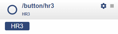
By clicking the button once the onclick action will be dispatched.
ondoubleclick???onpress???
The setup icon opens a dialog to change the configuration properties.
The Button Element acts on a value input typically created by a push button and a Digital Input Element.
It detects the gestures click, doubleclick and press and sends out the defined actions.
If you only need a button on the web ui but have no physically attached button the WebButton Element can be used as well.
Element Configuration
The following properties are available for configuration of the element:
value - This is the incoming logical value that is typically emitted by a digital input element.
onClick - These actions are emitted when a single press gesture was detected.
onDoubleClick - These actions are emitted when a double click gesture was detected.
onPress - These actions are emitted when a long press gesture was detected.
action - when receiving this event the specified action are dispatched. valid values are click, doubleclick and press.
onAction - These actions are emitted any time a click double-click or press gesture was detected.
The given value is click, doubleclick or press. This allows button actions to be send to other buttons even remote buttons.
clickTicks - the milliseconds to wait for another click before sending out the onclick action. Default is 250.
pressTicks - time to wait before sending out the onPress action when a long press is detected. Defaults is 800.
Control the Element
It is typical to use the Button Element together with a Digital Input Element that provides the input value to the Button Element.
Configuration Example
This example shows how to configure this element:
{
  "digitalin": {
    "up": {
      "pin": "D6",
      "description": "up button signal",
      "invert": "true",
      "pullup": "true",
      "onvalue": "button/up?value=$v"
    }
  },

  "button": {
    "up": {
      "onClick": "device/main?log=click.",
      "onDoubleClick": " device/main?log=doubleclick.",
      "onPress": " device/main?log=press."
    }
  }
}
Element State
active - Is set to true when the element is active.
value - Current output value of the element.
Example State
{
  "button/start": {
    "active": "true",
    "value": "1"
  }
}