Select Element
The SelectElement is used to choose one of many options with keys and a values. When selecting one of the options a key action and a value action is dispatched.
This is useful when a parameter to an action is not a numeric or boolean value that can be given by a Value Element or Switch Element.
In the configuration a list of options is defined containing each a key and value.
When selecting one of the options by the web frontend or by an event a key and a value actions will be dispatched.
A select element can also be controlled over the network by using a simple links like:
http://homeding/api/state/select/station?key=hr3
http://homeding/api/state/select/station?index=2
http://homeding/api/state/select/station?next=1
Web UI for the PWMOut Element
There is a dedicated card for this element available that will be used for the web server config and landing pages:
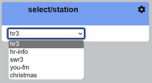
The Web UI for the Select element shows the actual selected key and all available options for selecting.
Element Configuration
This element implements the following properties and actions:
cycle – This boolean parameter allows the
nextandprevactions to cycle through the given options.options[] - This is the array of options with
keyandvalue.key - This action is used to select the option with a specific key.
index - This action is used to select the
nth option.next - This action will select the next option.
prev - This action will select the previous option.
onKey - This action will be dispatched with the current selected
key.onValue - This action will be dispatched with the current selected
value.
From the base element implementation the following properties are available for configuration:
title – Caption text for the element. Used by the element specific cards on the dash boards.
description – A line of text that gives a short description of the device used in the web UI.
room – The location of the device.
loglevel – This property holds the element specific log level. The default value is LOGGER_LEVEL_ERR == 1.
startup – This property can be used to start the element using a different initialization phase. Possible values are “sys”, “net”, “time”. See The Startup sequence.
Configuration Example
This example shows how to configure this element:
{
  "select": {
    "station": {
      "options": [
        { "key": "hr3", "value": "https://dispatcher.rndfnk.com/hr/hr3/live/mp3/high" },
        { "key": "hr-info", "value": "https://dispatcher.rndfnk.com/hr/hrinfo/live/mp3/high" },
        { "key": "swr3", "value":       "audio/0?url=https://liveradio.swr.de/sw331ch/swr3/"},
        { "key": "you-fm", "value":"audio/0?url=https://dispatcher.rndfnk.com/hr/youfm/live/mp3/high"},
        { "key": "christmas", "value": "audio/0?url=https://1000christmashits.stream.laut.fm/1000christmashits" }
      ],
      "cycle": "1",
      "onKey": "displaytext/station?value=$v",
      "onValue": "audio/0?url=$v"
    }
  }
}
It is not required to specify a value for each options in case the keys can be used in the created action using the onKey events only.
State
Some internal values of the element can be observed in the state.
{
  "select/station": {
    "active": "true",
    "index": "1",
    "key": "hr-info",
    "value": "https://dispatcher.rndfnk.com/hr/hrinfo/live/mp3/high"
  }
}