Value Element
The ValueElement combines receiving modifying actions for a numeric integer value and sending actions on changing the value. This can also be used as a base class for more specific elements like the switch or calc element.
The ValueElement is often used as the internal state element of a parameter or value of other elements like the brightness of a display. that can be changed by a specific action. Also this Element can directy sen its value to a pwm output to control a LED.
The ValueElement can persist the current value using the state Element that will be reused after a power down/up cycle.
Web UI
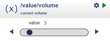
On the board page this element is presented by using a specialized widget that visualizes and enables controlling the actual value:

The slider can be used to adjust the value interactively and the arrows allow single step changes.
The setup icon opens a dialog to change the configuration properties.
Value Properties and actions
The Value Element is used to implement a property or parameter as a single value independent from a specific Element. The Value Element can send actions to other Elements whenever the value changes.
The values itself can be modified by other Elements using several modifying actions and by the corresponding web UI.
Example
Two Buttons should be used to increment and decrement the brightness of an attached LED.
Solution
- Two ButtonElements are created to capture this input from digital input lines.
- Each button will trigger an up / down action for a ValueElement.
- The ValueElement defines the default value and valid range for the value.
- When the value changes the new value is sent to the PWMOutElement.
Here the ValueElement can help. It allows
- Setting a default value used at startup
- Get an up action to increment the value
- Get a down action to decrement the value
- Get a set action to set the value (e.g. to 0)
- Can limit the value to a lower and upper limit
- Send out an action when the value changes.
Element Configuration
The following properties are available for configuration of the element.
min – Defines the minimum of the value.
max – Defines the maximum of the value.
step – The value will be incremented / decremented by the multiple of the step value when using the up / down actions.
value – An initial/default value can be set using the configuration.
onValue – These actions will be emitted whenever the value has changed.
up – the value can be incremented by the passed value. Negative values are allowed.
down – the value can be decremented by the passed value.
label – The label is used together with the menu element to show the current selected value.
From the base element implementation the following properties are available for configuration:
title – Caption text for the element. Used by the element specific cards on the dash boards.
description – A line of text that gives a short description of the device used in the web UI.
room – The location of the device.
loglevel – This property holds the element specific log level. The default value is LOGGER_LEVEL_ERR == 1.
startup – This property can be used to start the element using a different initialization phase. Possible values are “sys”, “net”, “time”. See The Startup sequence.
This Element supports Persisting Current State of Elements for the current values.
useState – set to true for saving the current values in the Device State.
Examples for actions
The value element accepts actions like
value/led?up=1to increment by 1value/led?up=10to increment by maximal 10value/led?down=1to decrement by 1value/led?up=-1to decrement by 1
Element State
The current value is reported as the state of a value element.
{
  "value/volume": {
    "active": "true",
    "value": "4"
  }
}
Example Configuration
{
  "value": {
    "volume": {
      "min": 0,
      "max": 15,
      "value": 3,
      "onvalue": "radio/r?volume=$v"
    }
  }
}
See also
- Switch Element
- Calc Element
- Persisting Current State of Elements
- Rotary Element
- Menu Element
- Dimmable LED recipe