Timer Element
The TimerElement can be triggered to start a timing pattern that sends out events after defined times.
During the specified time period the output value will be switched on and off once. The timer can be restarted automatically.
Web UI for the Timer Element
There is a dedicated card for this element available that will be used for the web server config and landing pages:
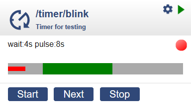
The web ui for the timer element show the pulseTime of the cycleTime using the green bar and the actual passed part of the cycleTime using the red bar.
The buttons allow restarting the cycle or advancing to the on or off time or stopping the timer.
This diagram shows the state, value and actions based on the settings:
Time Definitions:

|<-- waittime -->|<-- pulsetime -->|
|<------------- cycletime ------------------->|

When "cycletime" is not set it is automatically adjusted to "waittime" + "pulsetime".

Actions:

                 +--> "High"       +--> "Low"
|                |                            |
|________________/^^^^^^^^^^^^^^^^^\__________|
|                |                            |
                                              +--> "End"
When started and the specified wait time has passed the output value is set to one for the specified time.
The cycle time and the type LOOP can be specified to restart the timer automatically.
An action is emitted every time the output value changes and when the timer has ended.
Element Configuration
The following properties are available for configuration of the element:
waitTime – time before “on” action
pulseTime – time between “on” and “off” action.
cycleTime – time of a complete timer cycle. When not specified or too low the cycletime gets adjusted to waittime+pulsetime.
mode – The element supports 3 modes: “on” for always on, “off” for always off and "timer" for switching the value using the timer settings.
restart – When set to “true” or “1” the timer restarts automatically when cycleTime is over.
onHigh – These actions are dispatched when the pulse time starts.
onLow – These actions are dispatched when the pulse time ends.
onValue – These actions are dispatched when the pulse time starts or ends
onEnd – These actions are dispatched when a timer ends by finishing the whole cycle and may restart.
From the base element implementation the following properties are available for configuration:
title – Caption text for the element. Used by the element specific cards on the dash boards.
description – A line of text that gives a short description of the device used in the web UI.
room – The location of the device.
loglevel – This property holds the element specific log level. The default value is LOGGER_LEVEL_ERR == 1.
startup – This property can be used to start the element using a different initialization phase. Possible values are “sys”, “net”, “time”. See The Startup sequence.
Control the Element
The timer element can run on it’s own but can also be controlled by the following incomming actions:
start - Receiving this action starts the timer from the beginning.
stop - Receiving this action stop the timer.
next - Receiving this action advances the timer to on / off .
Configuration Example
{
  "timer": {
    "led": {
      "mode": "timer",
      "restart": "1",
      "waittime": "4s",
      "pulsetime": "8s",
      "cycletime": "20s",
      "onHigh": "digitalout/led?on",
      "onLow": "digitalout/led?off"
    }
  }
}

{
  "timer": {
    "led": {
      "mode": "timer",
      "restart": "1",
      "waittime": "4s",
      "pulsetime": "8s",
      "cycletime": "20s",
      "onHigh": "device/0?log=onHigh",
      "onLow": "device/0?log=onLow",
      "onValue": "device/0?log=onValue %v",
      "onEnd": "device/0?log=onEnd",
    }
  }
}
State
The state of the timer element includes:
active - Is set to true when the element is active.
mode - Current mode of the element “on”, “off” or “timer”.
time - time passed since starting the cycle (in seconds).
value - Current output value of the element.
Example for State
{
  "timer/relay": {
    "active": "true",
    "mode": "off",
    "time": "0",
    "value": "0"
  }
}